Hello !
After a few months of producing illustrations in order to create the beginnings of a portfolio, I’ve finally got round to creating the website.
While uploading the images to illustrate my bio, I realized that I didn’t like the one I’d done for Singapore (I spent a year at the university in Singapore instead of a final year at Ponts Paristech in Champs-sur-Marne).
So I decided to make another one, and at the same time to share with you how I decided to make an illustration.
First, I searched through my photos of the time. Unfortunately, they weren’t any good at all. Indeed, if I take a photo for an illustration, I’m photographing a subject, not a mood or an overall view of a place, as you might want to do in a tourist photo to remember “what it was like”.
Then, I look for an angle from which the subject is interesting, stands out from the background and shows lines that enhance it. I also wait for the light to play with these lines, to create certain colors. I wait, shooting the subject several times from different angles, under different lights.
Back at the office, I review the photos and select one. Sometimes just one out of many. The one that catches my eye, the one that speaks to me, the one that makes me want to paint. The photo isn’t necessarily excellent, but I can see the potential of the illustration behind it.
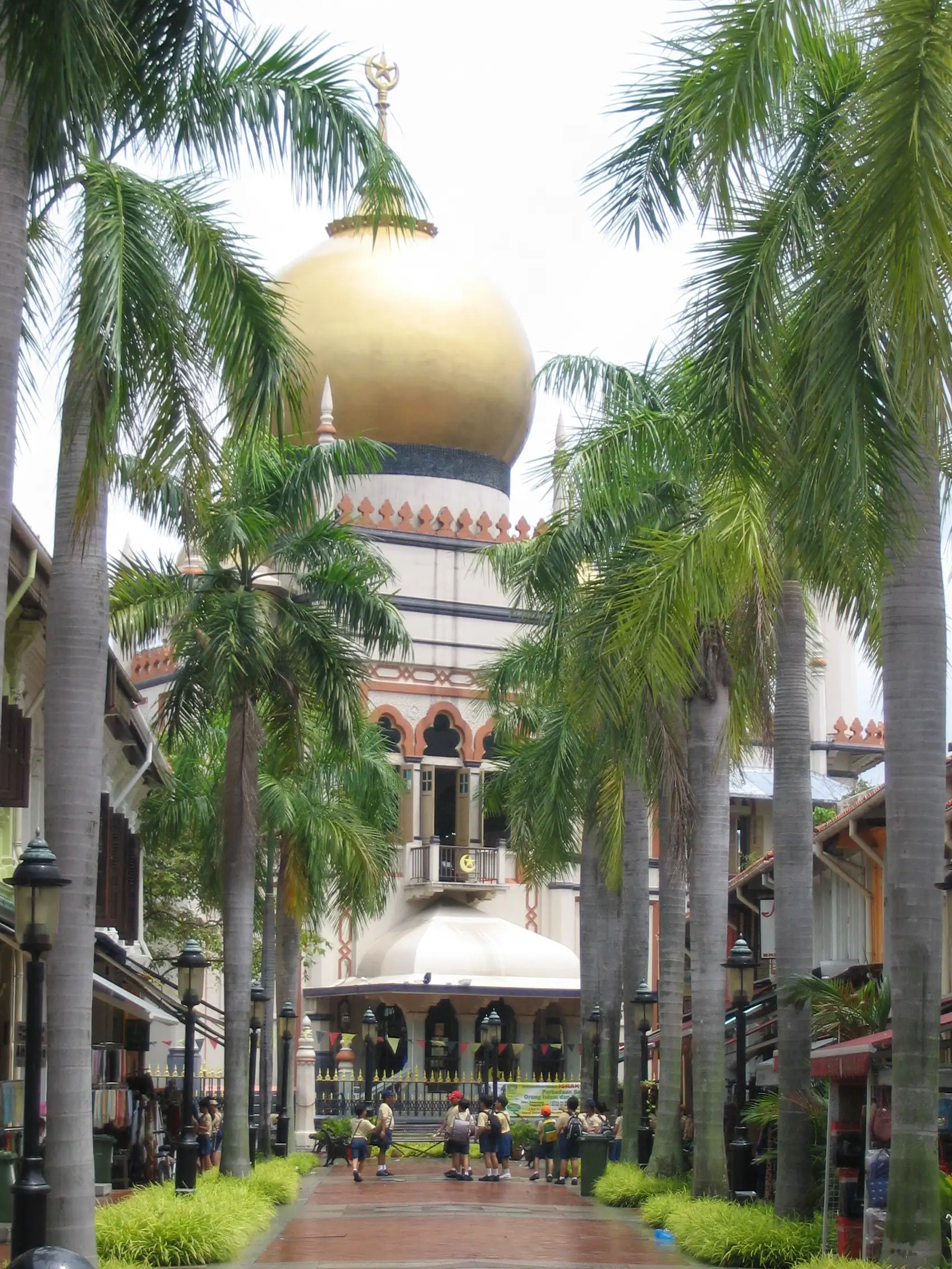
In short, in trying to illustrate my bio based on travel photos taken 20 years ago, I found myself having to make do with what I had. That’s why I didn’t like the first illustration : the photo wasn’t really to my taste. I could have searched the internet for a photo taken by someone else of this very photogenic mosque (Sultan Mosque), but it didn’t appeal to me.
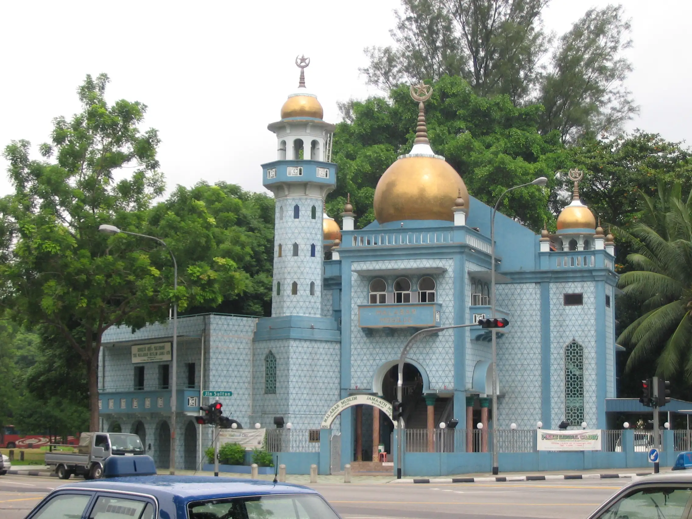
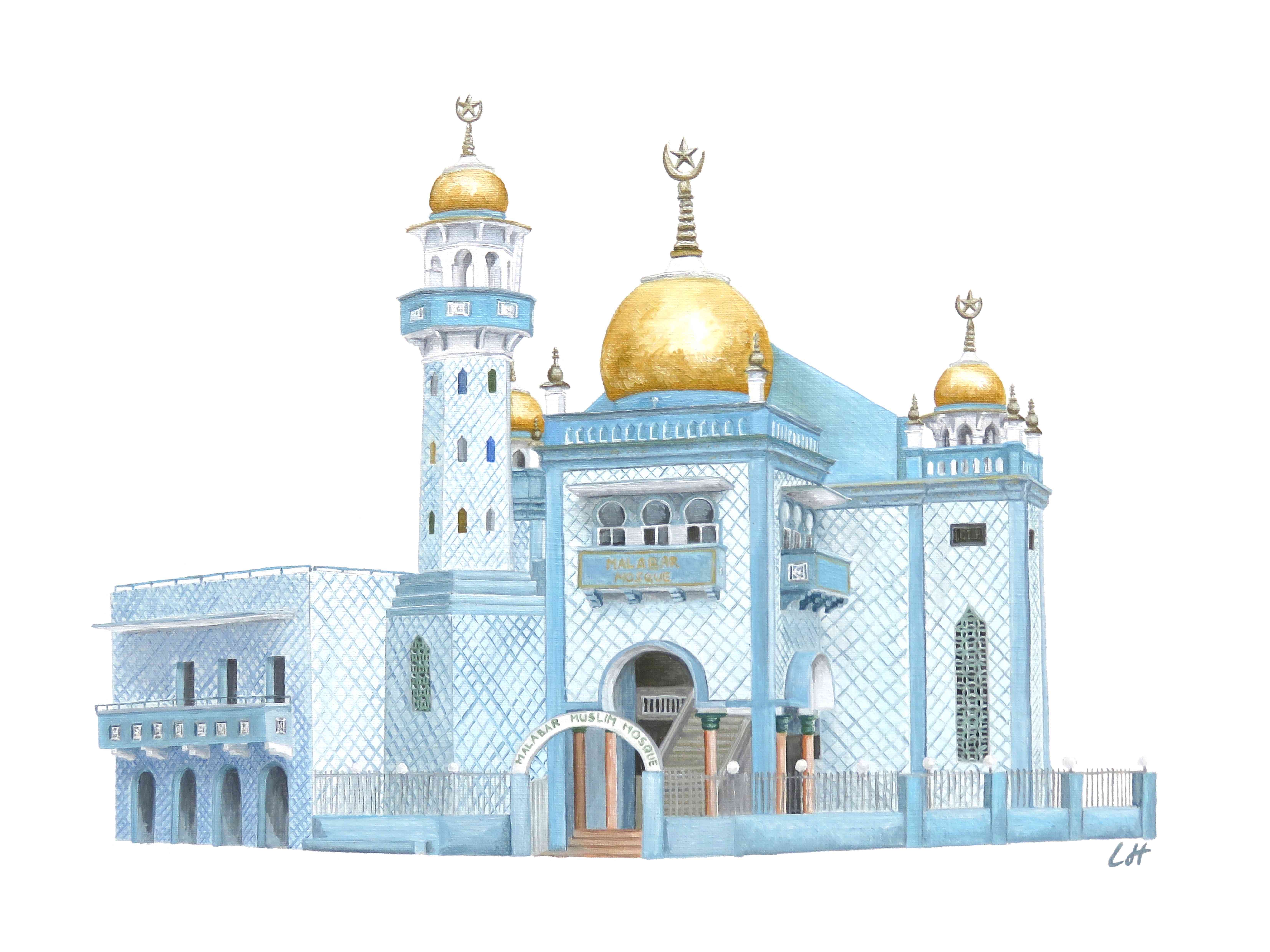
So I went back to my personal files and unearthed this other (unsatisfactory) photo of a (very pretty) blue mosque. The light and the lines aren’t really there, but it’s all right and I thought I should be able to get something acceptable out of it for an illustration.
As it wasn’t a commission, I didn’t need to work on the composition. I started directly from the photo to draw the lines that would guide the painting. I draw a lot of details at this stage, because once I’m with the brush, I like to concentrate on the color and not have to think about the drawing.
Next is my favorite part. There’s a coloring aspect to it : I fill in each drawn area. But it quickly gets messy, with brushstrokes left and right when I’ve got a color in hand and I think it’s repeated here and there on the subject.
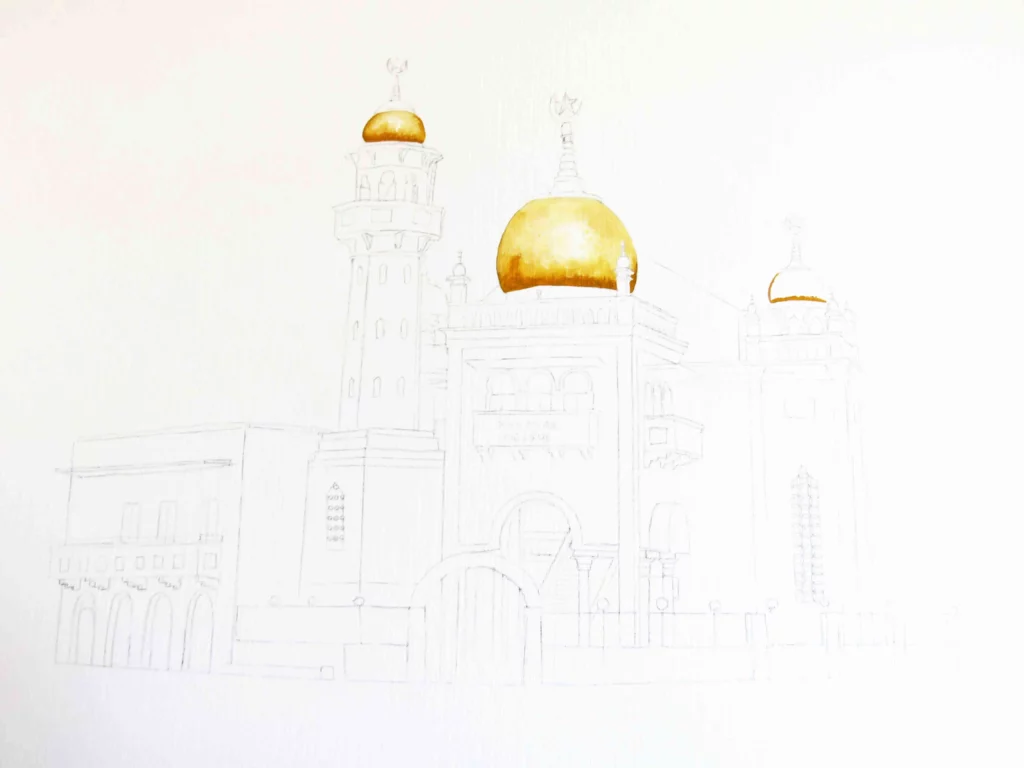
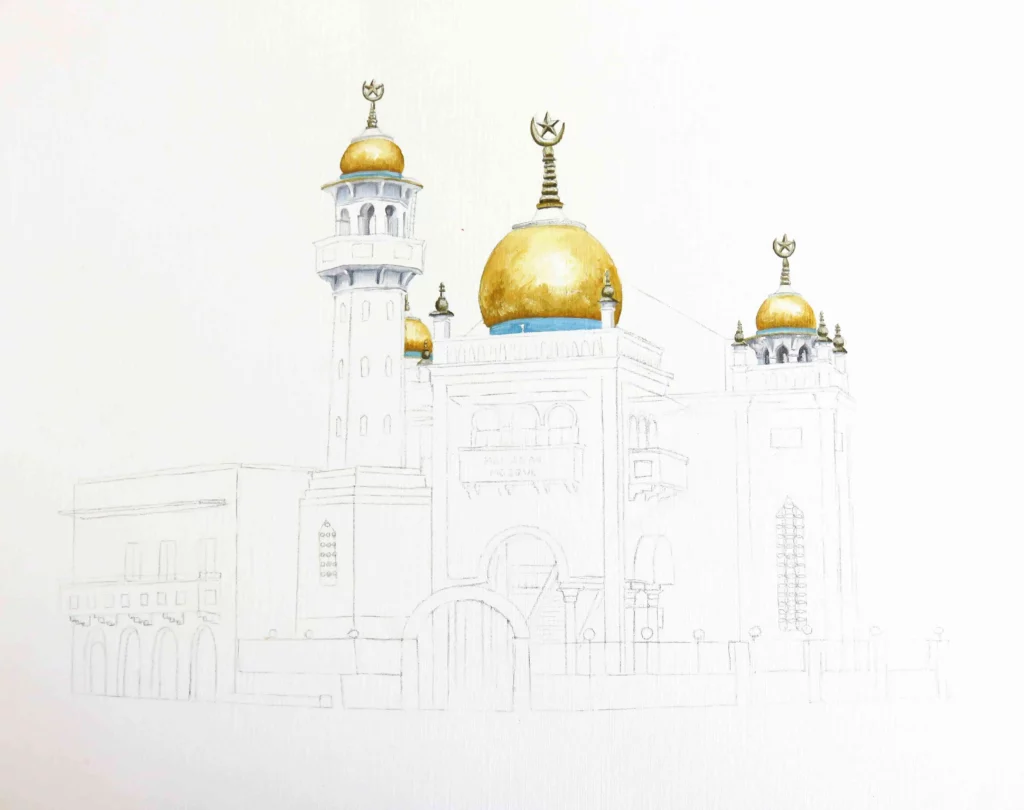
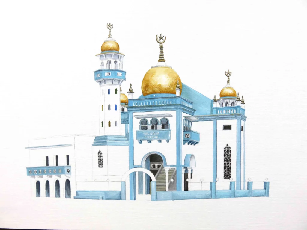
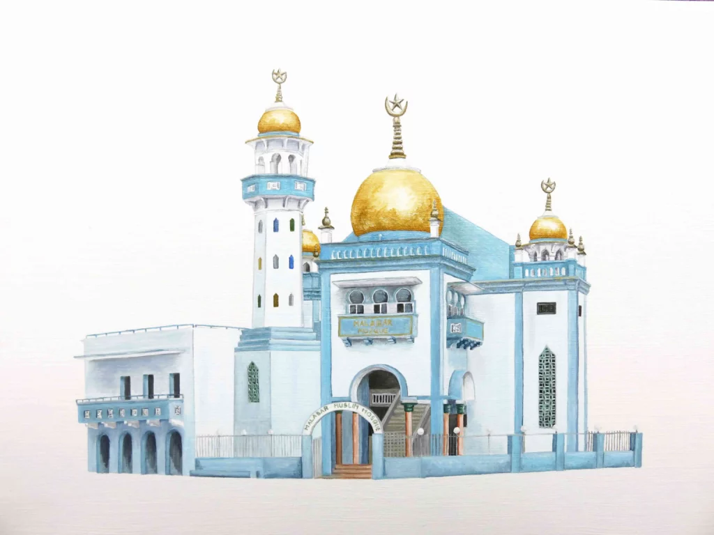
Here we see the advantage of illustration over photography : I was able to isolate the subject from its environment (vehicles and traffic lights in the foreground, a tree shading the side, a banner on the fence).
PS : You will find the previous articles here.
You can follow me on instagram, pinterest, facebook or linkedin or subscribe to get the articles directly in your mailbox.
